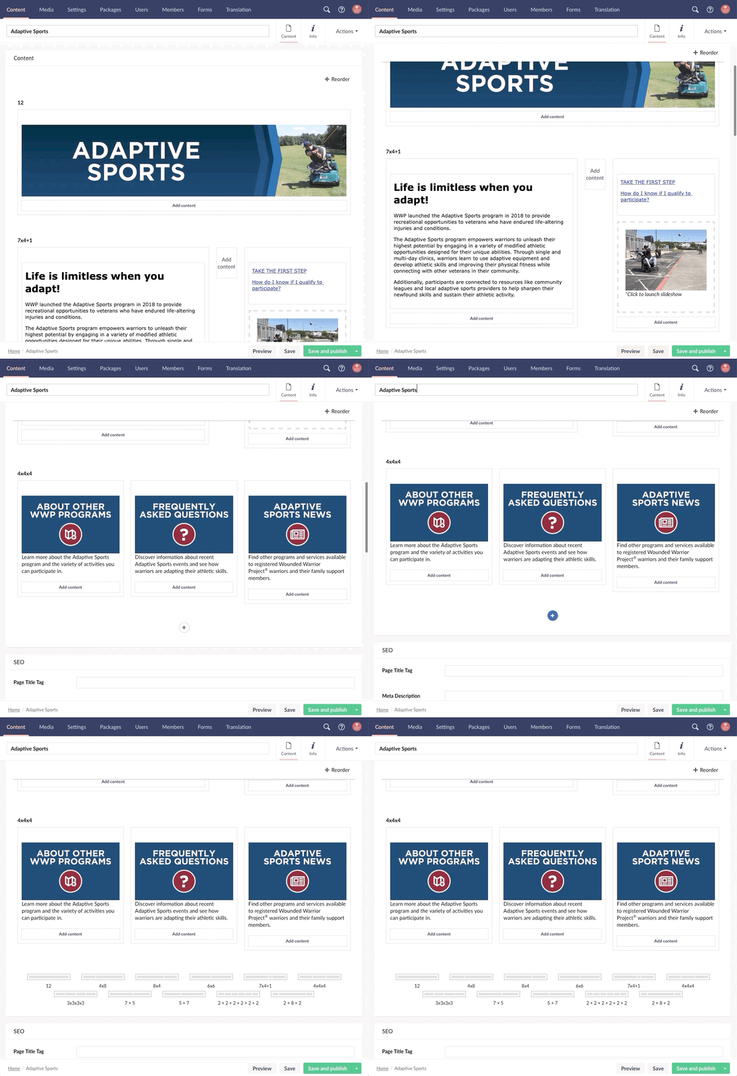
Grid Layout
Table of Contents
Introduction
The Grid Layout Page Component allows an editor to easily setup a grid content area for their website. The content allowed within the grid layout is completely customizable and configured by a developer during the buildout.

To learn more about the default Grid Layout property editor included in Umbraco, refer to the Umbraco docs here.
Grid Layout Document Type Schema
The Grid Layout Document Type is used for general content entry in the website.
- Tree Structure
- Document Types > Page Components > Grid Layout
- Document Type Name
- Grid Layout
- Document Type Alias
- pcGridLayout
- Document Type Icon
- icon-grid color-orange
- Design Tabs
- Content
- Design Tab Compositions
- Component Settings
- List View
- No custom settings
- Permissions - Allowed child node types
- Site Specific Macro Items
- Templates
- None
Design Tabs
Content Tab Properties:
| Title | Alias | Property Editor | Property Editor Alias |
|---|---|---|---|
| Grid | grid | Grid layout | Umbraco.Grid |
Data Type References
The Grid layout property editor used for the Grid property is configured based off of the initial design evaluation with different row configurations as needed.
To learn about configuring the grid layout data type built in umbraco, refer to the Umbraco docs here.
Page Component Code
| Page Component | File Path | Github Link |
|---|---|---|
| Grid Layout | ~/Views/Partials/PageComponents/_pcGridLayout.cshtml | View on Github |
How It Works
The Grid Layout Page Component acts as a base for all page components. The Starterkit Package installs the base page components functionality along with the Grid Layout Page Component.
Because the Grid Layout Page Component utilizes the most basic settings for page components, this sets the standard for the doctype composition Component Settings as well as the partial view code when creating new page components.
To learn more about how page components work, see the Components Library How It Works documentation.